Three versions of the same slide, and why you only ever build one
On paper you draw a page three ways in two minutes and the right one is obvious. In PowerPoint the second version costs what the first one cost, so it never gets built. Versions makes Decky AI build two or three takes of the same slide at once, side by side, and you keep the one that works.
You are working out a page. Four segments, two measures each, and a point to land about where the capacity is going. On the back of the agenda you draw it three ways in about two minutes. Bars with the growth rates called out. A two by two with the segments as bubbles. A ranked table with the mismatch in the last column.
You do not deliberate. You look at the three of them next to each other and one is obviously right, and you knew it in the second or two it took your eye to cross the page.
Then you open PowerPoint and build one.
The version you draw but never build
The habit of drawing a page several ways is not indecision. It is the cheapest analysis available. Form is not decoration: a two by two makes a trade-off visible that a table hides, and a table makes a ranking exact that a chart only gestures at. Which one is right depends on what the page has to prove, and the fastest way to find out is to see them beside each other.
Paper is good at this for one reason. An alternative costs almost nothing. The second sketch takes forty seconds, the third takes thirty, and by then you have compared three real things instead of imagining two of them.
On screen that economics inverts. The second version costs what the first version cost: the same chart to build, the same text boxes to align, the same fight with the legend. An hour, if it is a real exhibit. So the second version does not get built, and the choice about form quietly moves from something you can see to something you assert.
Why the second version costs the same as the first
That inversion explains a familiar failure. The decision about how a page should look gets made where it is cheapest to be wrong, in your head before anything exists, and gets revisited where it is most expensive, in the review after the thing is built. A partner asks whether you tried it as a waterfall. The honest answer is often no, not because it was the wrong idea but because trying it meant an hour you did not have at 11pm.
So you defend the version that exists. Not because it is better, but because it is the only one in the room.
This is the same asymmetry that keeps the real thinking on paper. It is why consultants draw the page before they build it, and why the drawing is so often better argued than the deck it becomes. Paper is where alternatives are affordable.
What changes when three versions arrive together
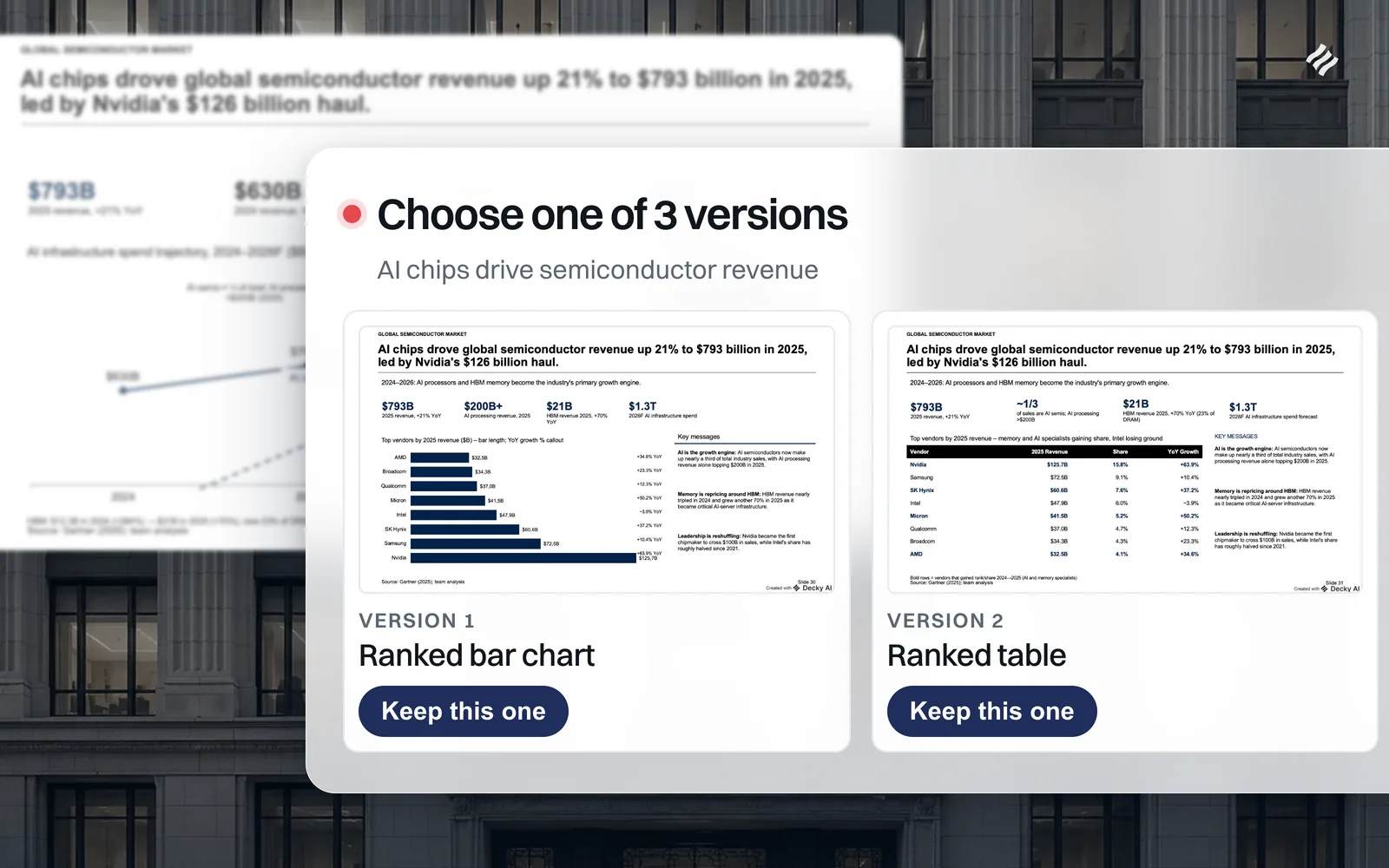
Versions is a setting in the chat panel: an icon in the row beside web search, clicked once for two versions and again for three. Switch it on, ask for a slide, and instead of one slide you get two or three, built at the same time, inserted in the deck next to each other.
A card appears in the chat with the three of them side by side, each labelled with the form it took. Click a preview and PowerPoint jumps to that actual slide, at full size, on your template, so you are judging the real thing rather than a thumbnail. Press Keep this one and the others are removed. Press Keep all and every version stays in the deck.
The detail that makes it predictable is what is allowed to differ. Content is fixed across versions: the same title, the same numbers, the same wording, the same source line. What varies is the visual form, and specifically the form rather than the arrangement. A different chart type, a table where the other has a chart, KPI cards, an icon grid, a process flow. Two versions that shuffle the same blocks into different corners are not two versions, and the model is told so in those words, because that was the first thing that went wrong when we tested it.
One consequence worth planning for: a brief that prescribes the layout defeats the whole thing. If you ask for metrics in a row along the top and the chart underneath, both versions will do exactly that, because both are obeying you. Describe what the page has to say and let the versions differ.
Here is what that looks like on a real page. One brief, one action title, three versions. The finding is identical in all of them, down to the figures and the Gartner source line. Only the exhibit changes.
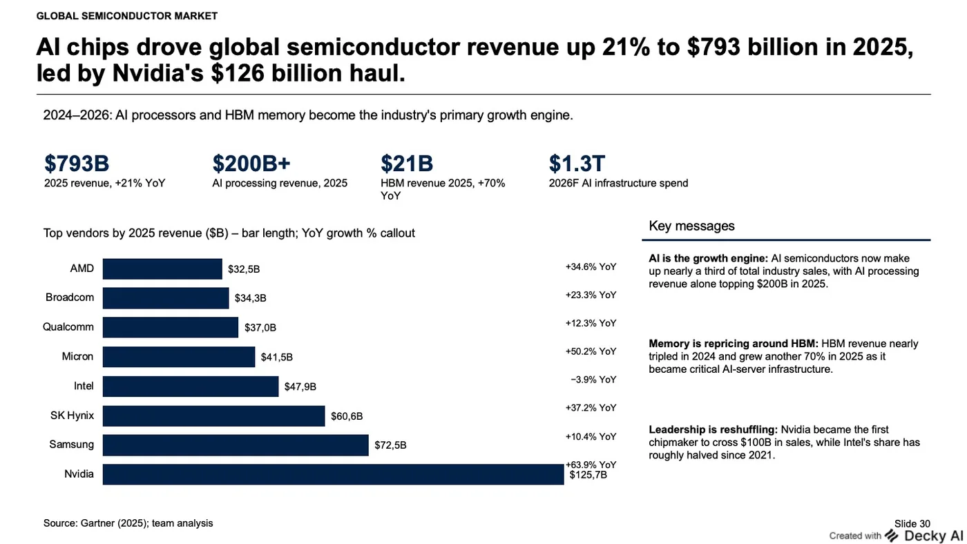
Ranked bars. Eight vendors ordered by revenue, growth called out beside each bar. Keep this one if the point is the gap between Nvidia and everyone else, because the eye reads that gap as length without doing arithmetic.
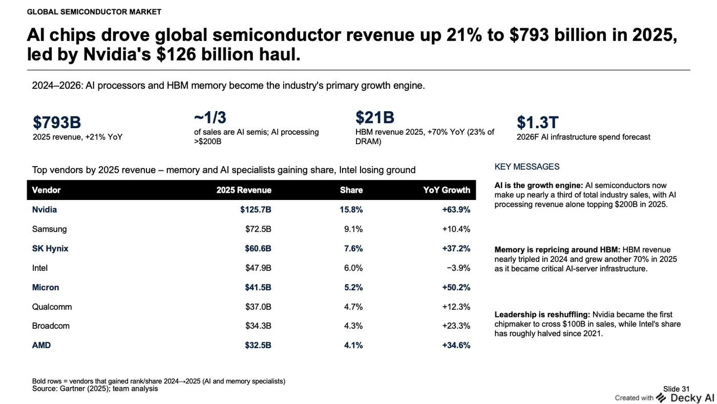
Ranked table. The same vendors, but share and growth now sit beside revenue and can be read exactly. It carries a column the chart could not, and it bolds the vendors that gained share, a claim the bars make only implicitly. Keep this one if someone is going to ask what Micron did.
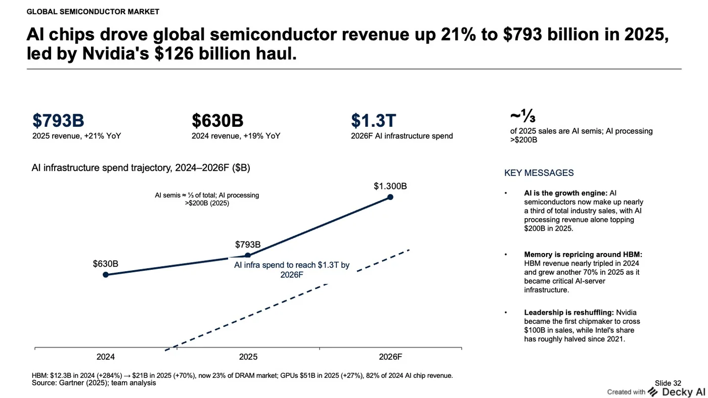
Trajectory line. Three points, 2024 to a 2026 forecast, vendor detail dropped entirely. It answers a different question: not who is winning, but where this is going.
Notice that none of the three is a rearrangement of another. That is the test. If you can describe the difference as “the chart moved to the left”, it is one version shown twice.
Two of them will be wrong, and that is the point
Nobody sketches three versions on paper expecting three good ones. You draw them to find out which form the argument wants, and you find that out by seeing two that do not work. Versions behaves the same way. Three takes where one is right and two are obviously not is a good two minutes, not a failure of the tool.
It is deliberately narrow. Versions applies when a message creates exactly one new slide, and is ignored for multi-slide deck builds and for edits to a page that already exists. Building a twelve page deck in triplicate is not a comparison, it is noise. It also stays switched on once you switch it on, with a badge on the icon so you always know which mode you are in, and if you walk away mid-choice nothing is thrown out.
The change is small and specific. The version you did not build used to be an argument you had with yourself, and the version that shipped won it by default. Now it is a slide in the deck, at full size, in your template, next to the other one.
You still have to choose. You just get to look first.

Maximilian Nitsche · Founder, Decky AI
I built Decky AI so anyone can put an MBB-level slide together and still be done before 8pm. I write here about the craft of consulting decks, and about what we ship.